In this post, I’m going to build a real touchpanel layout using Crestron’s CH5 template. I’m not going to worry too much about styling and customizing. I still remember the headache of digging through layers of CSS to try and override the default styles.
Node.js and NPM
My new laptop made it almost 5 months without me installing Node.js on it! I guess that time ends now. Going down the list of system requirements in the Getting Started guide, I need to get a few things:
- Node.js 20.04.0
- NPM 9.7.2
- Visual Studio Code
Luckily, I already have VS Code installed, and it seems to update every time I open it. I’ll quickly setup Node.js and NPM for Windows and then meet you back here.
Time passes…
I just installed Node.js 24.14.1 (LTS) and NPM 11.11.0 so ready to get started with CH5. If you aren’t sure how to do this, I think I’ve written about it before, and there are many guides on the Internet.
ch5-utilities-cli
Next, I’ll install the ch5-utilities-cli and ch5-shell-utilities-cli packages:
npm install -g @crestron/ch5-utilities-clinpm install -g @crestron/ch5-shell-utilities-cli
Now we’re ready to start working on a new template project.
Setup
I’m going to go a little fast in this part because I feel like this is a well-traveled path at this point. Go to Terminal > New Terminal then enter the following command:
ch5-shell-cli create:project --projectName "CH5 2026 Template"Please enter name of the Project to be created> ch5-ui-2026
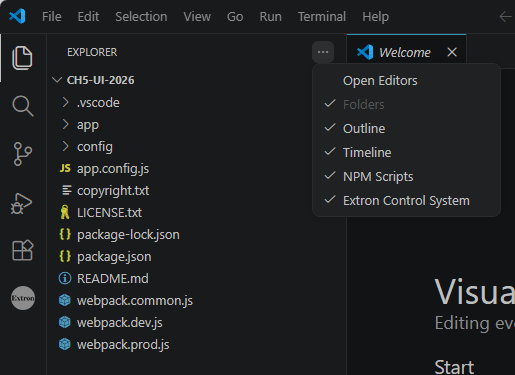
This will create a new folder with the project name (ch5-ui-2026). Open it in VS Code from the File > Open Folder menu. You might also want to check that NPM Scripts are showing in the accordion menu:
In the Terminal window, type:
npm install
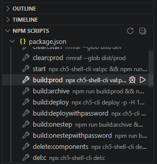
After a minute or so, all the dependencies should be installed. Lets check to make sure we can successfully build the project and archive it:
npm run build:archive
You can also run these scripts by clicking the Play button next to them in the NPM Scripts window:
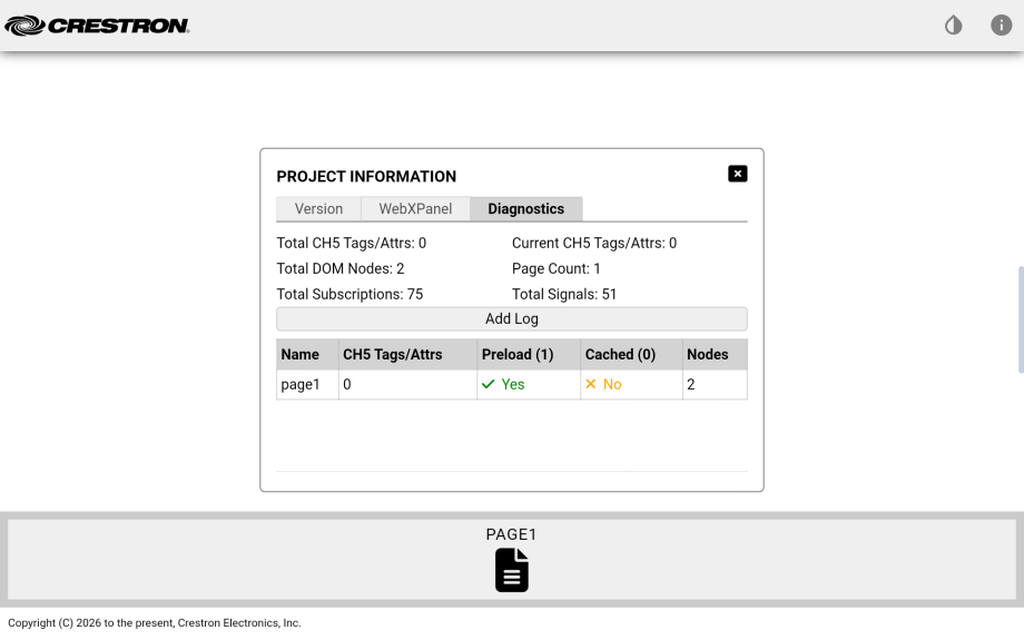
Once finished, navigate to the ch5-ui-2026\dist\prod folder to find ch5-ui-2026.ch5z ready to load! I’ve got a TS-1070 I’m going to load it to, but we’ll look at Web XPanel support in just a moment.
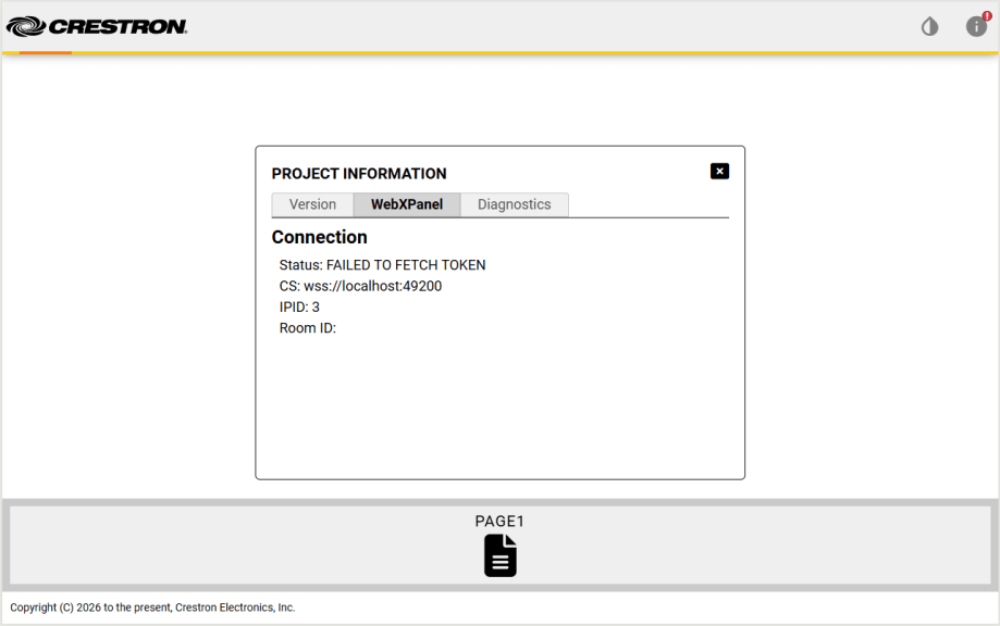
Out of the box, you get a single page with the Crestron logo, a theme selector (Light or Dark modes), and a nifty diagnostics pop up. Here it is for our empty project:
Building our project and loading to a physical touchpanel takes a lot of time, but web development is all about instant gratification! Try running the start NPM script instead and you can see a live demo of your layout in action (make sure to test in Google Chrome):
We won’t have an actual control system connection, but we can preview the look and feel without having to spend time loading to real hardware. This is the biggest advantage of using modern programming tools.
Main Page
Project Composition gives a nice overview of how the Shell Template works.
If we look in the app/project-config.json file, we can see where most of the project configuration happens. For instance, here we can decide on the menu orientation (horizontal, vertical, or none):
{
  "projectName": "ch5-ui-2026",
  "projectType": "shell-template",
  "version": "0.0.1",
  "faviconPath": "favicon.ico",
  "menuOrientation": "horizontal",
  "selectedTheme": "light-theme",
  "useWebXPanel": true,
What I’d like to do first is add a Main page that the layout can default to. Let’s use the generate:page NPM script to create a new one:
? Please enter page Name: Main? Please confirm that the new page should be added to Page Navigation: YesCongratulations! The page 'main' has been created...
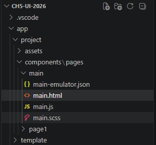
A new folder structure has been created with our new page:
I’d like to stick some text on this page, so open app/project/components/pages/main/main.html and add the following:
<section id="main-page" class="details-container" aria-labelledby="Main">
<!-- BEGIN::CHANGEAREA - your page html markup goes here -->
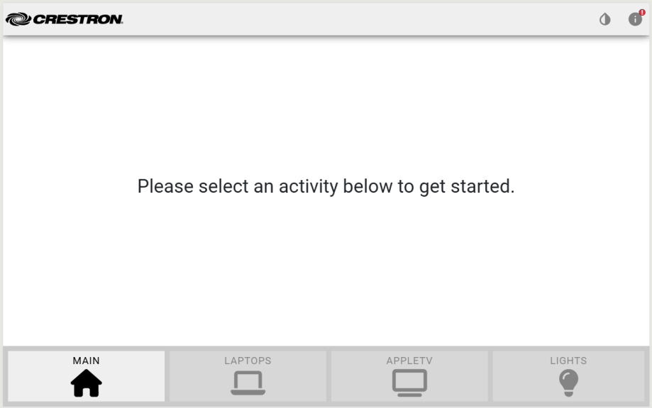
<p class="big">Please select an activity below to get started.</p>
<!-- END::CHANGEAREA -->
</section>
If we look at the Terminal window for the start script, it tells us there was a change to app/project-config.json and to restart. Easy enough, just click the restart button next to the task.
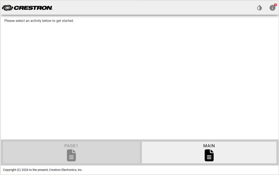
If you refresh the page in Chrome, you can see our new Home page added to the navigation across the bottom and our text appears on the page:
A little CSS added to main.scss makes it look more like what I had in mind. If you need any help understanding Flexbox, Flexbox Froggy is a great refresher.
#main-page {
    // BEGIN::CHANGEAREA - your page level styles go here

    display: flex;
    justify-content: center;
    align-items: center;

    .big {
        font-size: 28pt;
    }

    // END::CHANGEAREA
}
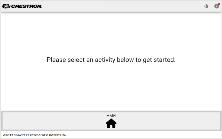
While I’m thinking about it, lets get rid of Page1. Run the delete:components NPM script and select page1:
? Please select the pages / widgets that you want to delete...page1? Please confirm that you want to delete the selected components...Yes
Goodbye Page1! We need to fix a problem in project-config.json now; we need to start on the main page instead of page1:
  "content": {
    "$defaultView": "main",
    "triggerViewProperties": {
      "gestureable": false,
      "disableAnimation": true
    },
And lets use a better icon for the main page:
    "pages": [
      {
        "pageName": "main",
        "fullPath": "./app/project/components/pages/main/",
        "fileName": "main.html",
        "preloadPage": true,
        "cachePage": false,
        "standAloneView": false,
        "navigation": {
          "sequence": 2,
          "label": "main",
          "isI18nLabel": false,
          "iconClass": "fas fa-house",
          "iconUrl": "",
          "iconPosition": "bottom"
        },
A Few More Pages
Lets follow the same process and add a few more pages to our layout. I’m going to create pages for Laptops, Apple TV, and Lights using generate:page. Add each page to the navigation menu, too.
Since we need to change some icons, I think I’d like to get rid of the page footer with the copyright notice. Modify project-config.json:
  "footer": {
    "display": false,
    "$component": ""
  },
Update the icon for Laptops:
        "navigation": {
          "sequence": 3,
          "label": "laptops",
          "isI18nLabel": false,
          "iconClass": "fas fa-laptop",
          "iconUrl": "",
          "iconPosition": "bottom"
        },
And AppleTV:
      {
        "pageName": "appletv",
        "fullPath": "./app/project/components/pages/appletv/",
        "fileName": "appletv.html",
        "preloadPage": true,
        "cachePage": false,
        "standAloneView": false,
        "navigation": {
          "sequence": 4,
          "label": "appletv",
          "isI18nLabel": false,
          "iconClass": "fas fa-tv",
          "iconUrl": "",
          "iconPosition": "bottom"
        },
        "animation": {
          "transitionIn": "",
          "transitionOut": "",
          "transitionDuration": "1s",
          "transitionDelay": "0s"
        }
      },
And finally Lights:
      {
        "pageName": "lights",
        "fullPath": "./app/project/components/pages/lights/",
        "fileName": "lights.html",
        "preloadPage": true,
        "cachePage": false,
        "standAloneView": false,
        "navigation": {
          "sequence": 5,
          "label": "lights",
          "isI18nLabel": false,
          "iconClass": "fas fa-lightbulb",
          "iconUrl": "",
          "iconPosition": "bottom"
        },
        "animation": {
          "transitionIn": "",
          "transitionOut": "",
          "transitionDuration": "1s",
          "transitionDelay": "0s"
        }
      }
We now have a few blank pages that we can navigate between:
Lets go page by page and add in the controls that we need.
Laptops
OK I took a break before writing this next part, so I’m trying to get back into the mindset of where I was going with it. I want multiple laptops to choose from, maybe some way to indicate which one is connected.
We need to add some buttons to the laptops page. Add the following lines to app/project/components/pages/laptops/laptops.html:
<section id="laptops-page" class="details-container" aria-labelledby="Laptops">
    <!-- BEGIN::CHANGEAREA - your page html markup goes here -->
     <div id="laptops">
        <ch5-button
            label="Laptop 1"
            sendEventOnClick="11"
            receiveStateSelected="11">
        </ch5-button>
        <ch5-button
            label="Laptop 2"
            sendEventOnClick="12"
            receiveStateSelected="12">
        </ch5-button>
        <ch5-button
            label="Laptop 3"
            sendEventOnClick="13"
            receiveStateSelected="13">
        </ch5-button>
     </div>
    <!-- END::CHANGEAREA -->
</section>
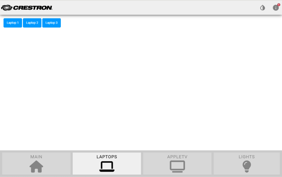
We’ll use 3 digital joins to select and indicate the active laptop connection: 11, 12, and 13. I might switch these to contract joins at the end of this post, just trying to see how far I can get first. The initial results aren’t great:
Such tiny buttons! I want them bigger and centered on the page. Lets mess around with CSS to style them the way I want. Add this to app/project/components/pages/laptops/laptops.scss:
#laptops-page {
    // BEGIN::CHANGEAREA - your page level styles go here
    display: flex;
    align-items: center;

    #laptops {
        height: 8em;
        width: 33%;
        margin: auto;
        display: flex;
        justify-content: center;
        gap: 1em;
    }
    // END::CHANGEAREA
}
This centers everything, but the buttons are still tiny. There is a property we can change on the buttons to make them grow to fill the space. Update laptops.html with:
<section id="laptops-page" class="details-container" aria-labelledby="Laptops">
    <!-- BEGIN::CHANGEAREA - your page html markup goes here -->
     <div id="laptops">
        <ch5-button
            label="Laptop 1"
            stretch="both"
            sendEventOnClick="11"
            receiveStateSelected="11">
        </ch5-button>
        <ch5-button
            label="Laptop 2"
            stretch="both"
            sendEventOnClick="12"
            receiveStateSelected="12">
        </ch5-button>
        <ch5-button
            label="Laptop 3"
            stretch="both"
            sendEventOnClick="13"
            receiveStateSelected="13">
        </ch5-button>
     </div>
    <!-- END::CHANGEAREA -->
</section>
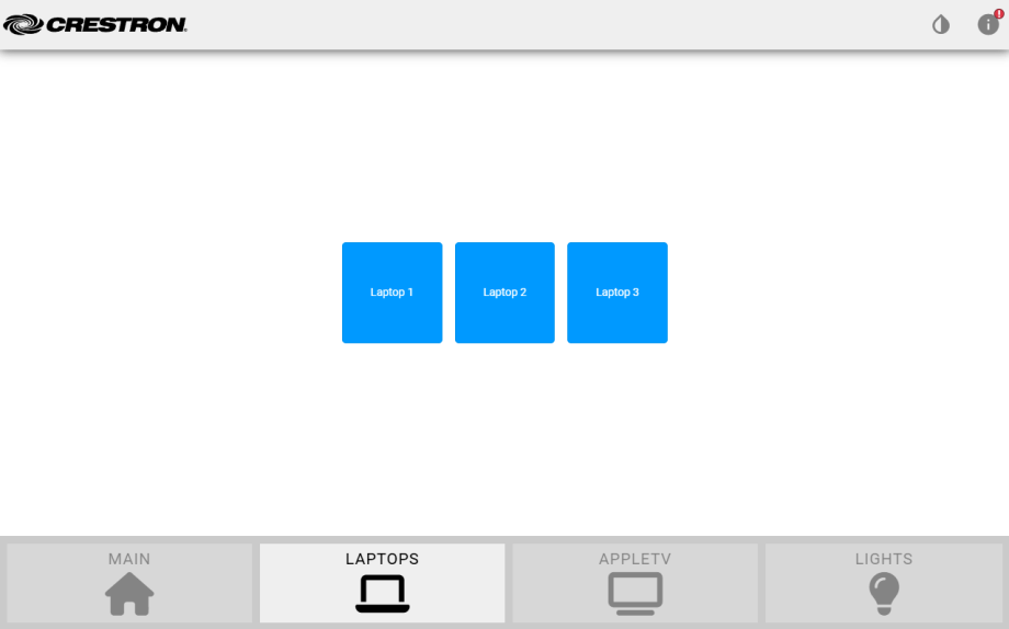
This gets us close enough for now to what I want:
AppleTV
For the AppleTV controls, I want to mimic the remote layout. Start by adding the following to app/project/components/pages/appletv/appletv.html:
<section id="appletv-page" class="details-container" aria-labelledby="Appletv">
    <!-- BEGIN::CHANGEAREA - your page html markup goes here -->
    <div id="appletv-dpad">
        <ch5-dpad
            shape="circle"
            size="large"
            type="secondary"
            sendEventOnClickStart="20">
        </ch5-dpad>
    </div>
    <div id="appletv-transports">
        <ch5-button
            label="Back"
            stretch="both"
            sendEventOnClick="25"
            receiveStateSelected="25">
        </ch5-button>
        <ch5-button
            label="Play/Pause"
            stretch="both"
            sendEventOnClick="26"
            receiveStateSelected="26">
        </ch5-button>
        <ch5-button
            label="Home"
            stretch="both"
            sendEventOnClick="27"
            receiveStateSelected="27">
        </ch5-button>
    </div>
    <!-- END::CHANGEAREA -->
</section>
Another screenshot of how it looks before we style anything:
Add some minimal style to appletv.scss:
#appletv-page {
    // BEGIN::CHANGEAREA - your page level styles go here
    display: flex;
    align-items: center;
    flex-direction: column;

    #appletv-dpad {
        margin: 5em;
    }

    #appletv-transports {
        display: flex;
        gap: 1em;

        ch5-button {
            .ch5-button {
                padding: 0.25em 2em;
            }
        }
    }
    // END::CHANGEAREA
}
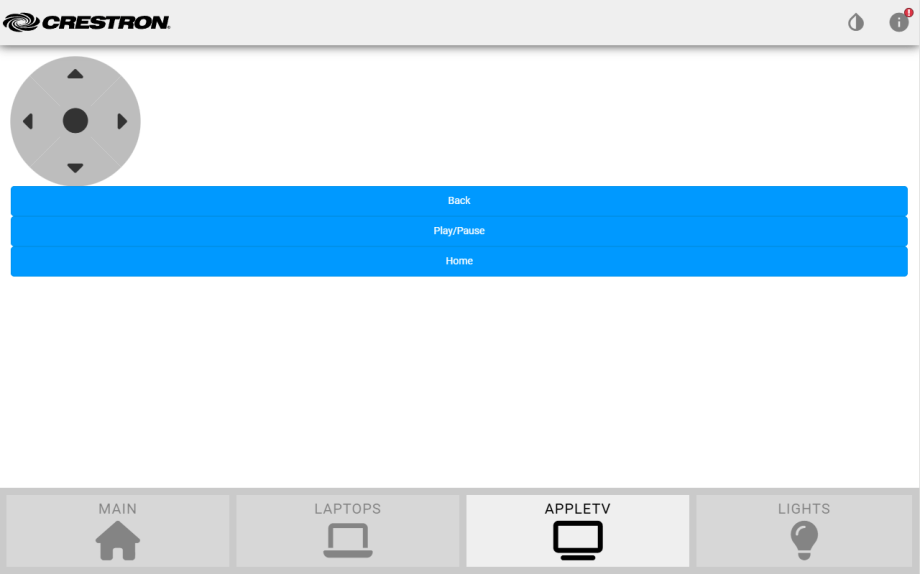
And we end up with something like this:
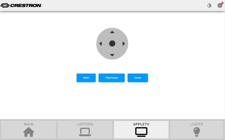
Close enough!
Lights
We’re going to have 3 preset buttons: On, Dim, and Off. There is also a slider to set a specific lighting level. Here’s the code for app/project/components/pages/lights/lights.html:
<section id="lights-page" class="details-container" aria-labelledby="Lights">
    <!-- BEGIN::CHANGEAREA - your page html markup goes here -->
    <div id="lights-presets">
        <ch5-button
            label="On"
            sendEventOnClick="31"
            receiveStateSelected="31">
        </ch5-button>
        <ch5-button
            label="Dim"
            sendEventOnClick="32"
            receiveStateSelected="32">
        </ch5-button>
        <ch5-button
            label="Off"
            sendEventOnClick="33"
            receiveStateSelected="33">
        </ch5-button>
    </div>
    <div id="lights-sliders">
        <ch5-slider
            orientation="vertical"
            size="large"
            handleShape="circle"
            sendEventOnClick="35"
            receiveStateValue="1">
        </ch5-slider>
    </div>
    <!-- END::CHANGEAREA -->
</section>
Add some style to lights.scss:
#lights-page {
    // BEGIN::CHANGEAREA - your page level styles go here
    display: flex;
    justify-content: center;
    gap: 5em;

    #lights-presets {
        display: flex;
        flex-direction: column;
        justify-content: center;
        gap: 1em;
    }

    #lights-sliders {
        display: flex;
        align-items: center;
    }
    // END::CHANGEAREA
}
And here’s what we get:
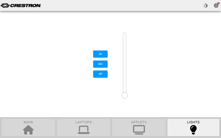
Fantastic.
SIMPL Windows
So that’s our UI. It isn’t quite what I had in my head, but I don’t really have the time to spend on tweaking it into shape. Lets see what it takes to get it programmed and communicating with a SIMPL program.
I’m going to stick with loading to a TS-1070 for now. Create a new SIMPL program and add the following to it:
- TS-1070 symbol
- AppleTV 4th Generation IR driver
- Interlock
- Analog Preset (x3)
- Serial Buffer
Here’s a screenshot of my program with signal names added:
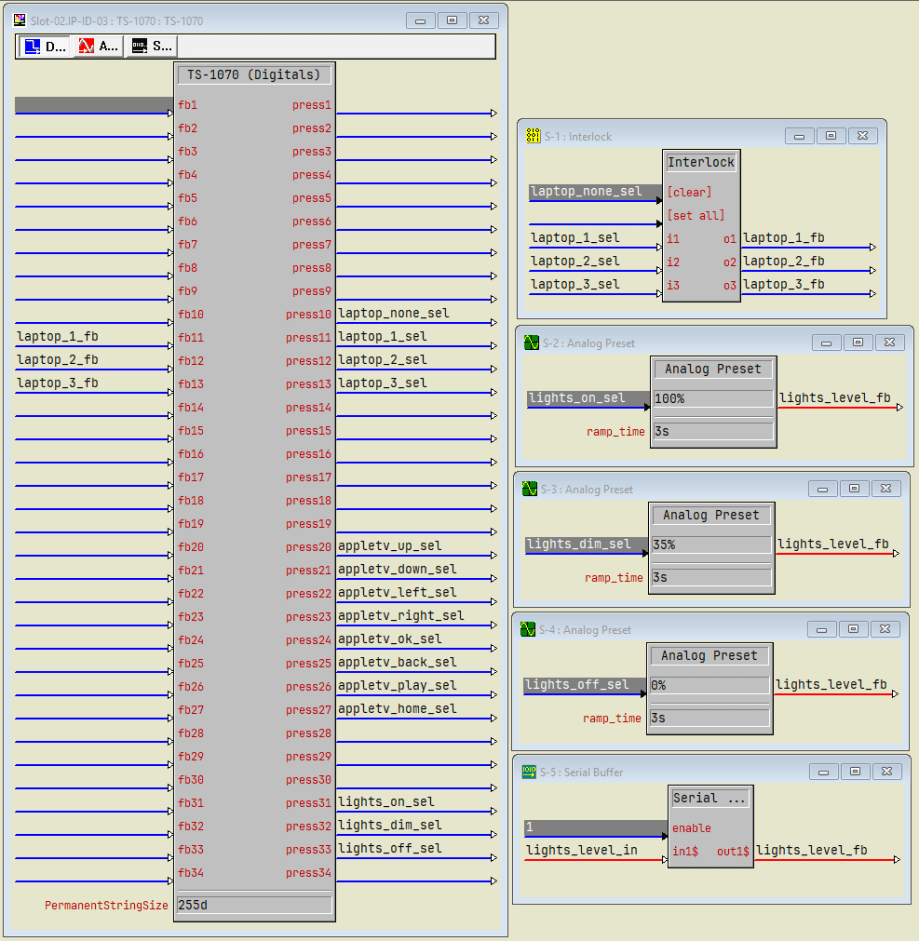
This program doesn’t do much, but it does show presses and feedback, ramping controls, and device control (not shown above). I’d like to clear out the selected laptop when visiting the AppleTV page, and that means having to track when that page is visible. Unfortunately, I can’t figure out how to attach sendEventOnShow to the TriggerView Child using the Shell Template. And the documentation is no help, so I give up.
Contracts
We’re only using a handful of join numbers in the SIMPL program, but I wanted to demonstrate how to switch over to contracts instead. The Contract Editor hasn’t seen an update in 6 years, so I’m going to say not to use it. It seems that conventional wisdom says to recreate your layout in Construct and add contracts that way, but that seems like a bit of wasted effort.
So in the next part, I’m going to rebuild the same layout in Construct. I have a feeling it will be easier to build, look better, and capture some of the functionality I gave up on using the CH5 framework directly.
Conclusion
That’s it for the Shell Template! It’s been a while since I messed around with it, and it still doesn’t seem to be worth the trouble. If you’d like to grab my code from this post, it’s available on my GitHub here: https://github.com/kielthecoder/CH5-UI-2026
See you next time!
 Kiel the Coder
thanks share now i learn construct app to build ui project.
LikeLike