tl;dr Yes, I actually go through each page of my mock up and try to make it work in CH5 so there’s a lot of HTML, CSS, and JavaScript in this post. I really wanted to link to a GitHub repo so you could download the files and follow along, but Crestron puts a copyright notice at the top of every generated file saying you can’t distribute them. So to be safe, I’m only including the bits here that I rewrote. Also, I plan to write a follow up post to this one that explores my thoughts trying to use the CH5 framework, so that might actually make for a better read anyway. But, if you want to follow my struggles trying to hammer HTML and CSS into shape, be my guest…
OK I think we’ve toyed around enough and can jump in feet first to CH5. In this post, I’m going to create a full touchpanel layout using Crestron’s Shell Template. We’ll focus on the look and feel in this post and deal with the control side later. That way, we don’t have to continually load to a touchpanel just to see if what we’re doing looks correct.
Wireframe Mock-up
We’re going to bring back an old friend to help us out on this part…VT Pro-e! Here’s my idea for the various pages:

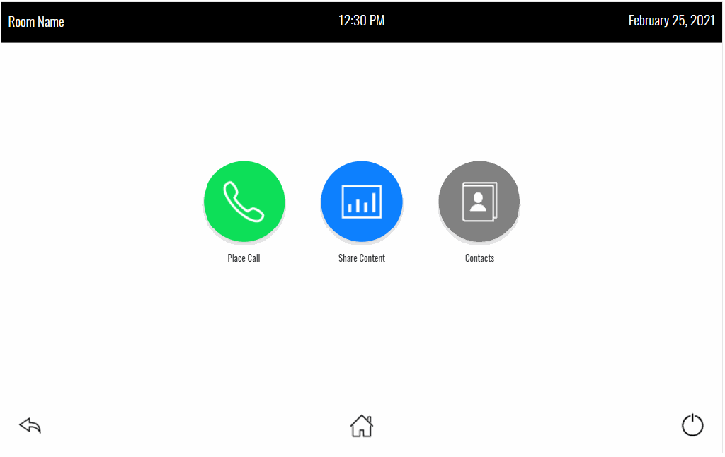
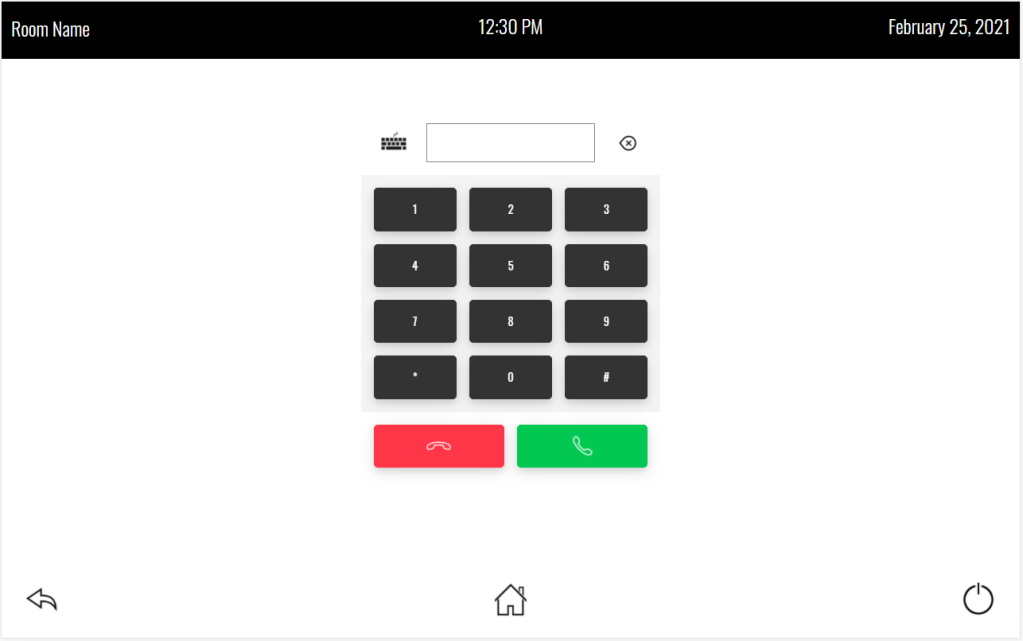
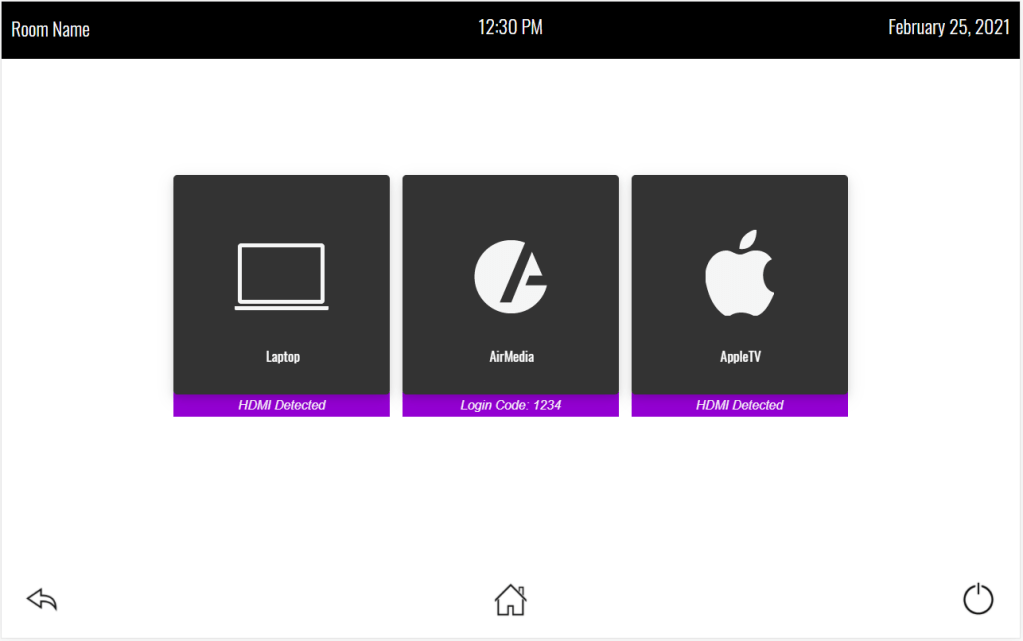
The idea is we’ll have the room name, current date, and time at the top of the page. The bottom has navigation buttons to get us around. The Home page has the various activities we can use this room for: place a call, share content, look up contacts. We have a keypad (or keyboard) we can use to place calls. There are three content sources in the system. If video sync is detected it will tell us, or in the case of the AirMedia, it will give us the login code. Contacts let us add, modify, and dial contacts.
With these screenshots as a reference, we can start planning out which CH5 components we’ll need to use and how to lay them out using CSS. I think I’m going to use:
- CH5 TriggerView for the different pages
- CH5 Button for the various buttons
- CH5 List for the contacts list
- CH5 Image for various images
- CH5 Overlay Panel for the shutdown prompt
Pages
We’re going to use the generate:page NPM script to generate some new pages for us:
> yarn run generate:page
Please enter Page Name >> Home
Please confirm that the new page should be added to Page Navigation ...
> Yes
Congratulations! The page 'home' has been created at the location './app/project/components/pages/home/'.
Let’s create the following additional pages:
- Dial
- Content
- Contacts
And go ahead and remove the existing page1, page2, page3, page4, page5, and page6 folders from /app/project/components/pages/ since we won’t be using them. The folder structure should now look like this:
We should also update project-config.json. We’re going to update the content field:
"content": {
  "$defaultView": "home",
  "triggerViewProperties": {
    "gestureable": false,
    "disableAnimation": true,
  },
  "pages": [
    {
      "pageName": "home",
      "fullPath": "./app/project/components/pages/home/",
      "fileName": "home.html",
      "standAloneView": false,
      "pageProperties": {
        "class": ""
      },
      "navigation": {
        "sequence": 1,
        "label": "home",
        "isI18nLabel": false,
        "iconClass": "",
        "iconUrl": "./app/project/assets/img/navigation/page.svg",
        "iconPosition": "bottom"
      }
    },
    {
      "pageName": "dial",
      "fullPath": "./app/project/components/pages/dial/",
      "fileName": "dial.html",
      "standAloneView": false,
      "pageProperties": {
        "class": ""
      },
      "navigation": {
        "sequence": 2,
        "label": "dial",
        "isI18nLabel": false,
        "iconClass": "",
        "iconUrl": "./app/project/assets/img/navigation/page.svg",
        "iconPosition": "bottom"
      }
    },
    {
      "pageName": "content",
      "fullPath": "./app/project/components/pages/content/",
      "fileName": "content.html",
      "standAloneView": false,
      "pageProperties": {
        "class": ""
      },
      "navigation": {
        "sequence": 3,
        "label": "content",
        "isI18nLabel": false,
        "iconClass": "",
        "iconUrl": "./app/project/assets/img/navigation/page.svg",
        "iconPosition": "bottom"
      }
    },
    {
      "pageName": "contacts",
      "fullPath": "./app/project/components/pages/contacts/",
      "fileName": "contacts.html",
      "standAloneView": false,
      "pageProperties": {
        "class": ""
      },
      "navigation": {
        "sequence": 4,
        "label": "contacts",
        "isI18nLabel": false,
        "iconClass": "",
        "iconUrl": "./app/project/assets/img/navigation/page.svg",
        "iconPosition": "bottom"
      }
    }
  ],
  "widgets": []
}
If you run the start NPM script, you can preview the changes we’ve made so far.
Header
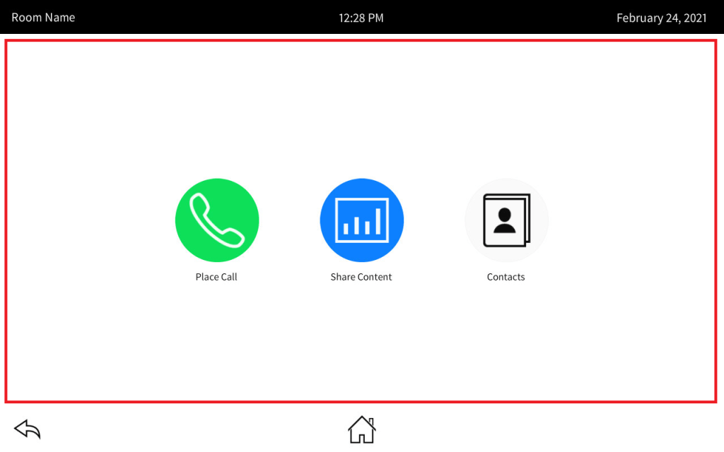
Let’s get the header looking the way we want since that should be easiest to start with. I’ve highlighted it here:
To change the look of this, we’re going to have to replace /app/template/components/pages/template-header/template-header.handlebars with:
{{#if header.display}}
<section id="header-page">
    <h1>Room Name</h1>
    <p class="time">12:30 PM</p>
    <p class="date">February 25, 2021</p>
</section>
{{/if}}
And we’ll add some style to /app/template/components/pages/template-header.scss:
#header-page {
    display: grid;
    grid-template-rows: 1fr;
    grid-template-columns: 1fr 1fr 1fr;
    align-items: center;
    background: black;
    color: white;

    h1 {
        color: white;
        font-weight: lighter;
        font-size: 18pt;
        padding: 0.5em;
    }

    p {
        font-weight: lighter;
        font-size: 18pt;
        padding: 0.5em;
    }

    .time {
        text-align: center;
    }

    .date {
        text-align: right;
    }
}
Footer
The footer is also easy:
Replace /app/template/components/pages/template-footer/template-footer.handlebars with this:
{{#if footer.display}}
<section id="footer-page">
  <div class="left">
    <ch5-button id="prevPage"
      shape="circle"
      customclass="btn-trans"
      customclasspressed="btn-trans-pressed"
      iconurl="./app/template/assets/img/Prev-Page_Dark.png">
    </ch5-button>
  </div>
  <div class="center">
    <ch5-button id="home"
      shape="circle"
      customclass="btn-trans"
      customclasspressed="btn-trans-pressed"
      iconurl="./app/template/assets/img/Home_Dark.png">
    </ch5-button>
  </div>
  <div class="right">
    <ch5-button id="shutdown"
      shape="circle"
      customclass="btn-trans"
      customclasspressed="btn-trans-pressed"
      iconurl="./app/template/assets/img/Power_Dark.png">
    </ch5-button>
  </div>
</section>
{{/if}}
And create template-footer.scss in the same folder:
#footer-page {
    display: grid;
    grid-template-rows: 1fr;
    grid-template-columns: 1fr 1fr 1fr;
    align-items: center;
    background: white;
    height: 100px;

    div {
        height: 80px;
    }

    .left {
        text-align: left;
    }

    .center {
        text-align: center;
    }

    .right {
        text-align: right;
    }

    .btn-trans {
        background: none;
        border: none;
        box-shadow: none;

        .ch5-button--img {
            width: 80%;
            height: auto;
        }
    }

    .btn-trans-pressed {
        background-color: rgba(0,0,0,0.1);
    }
}
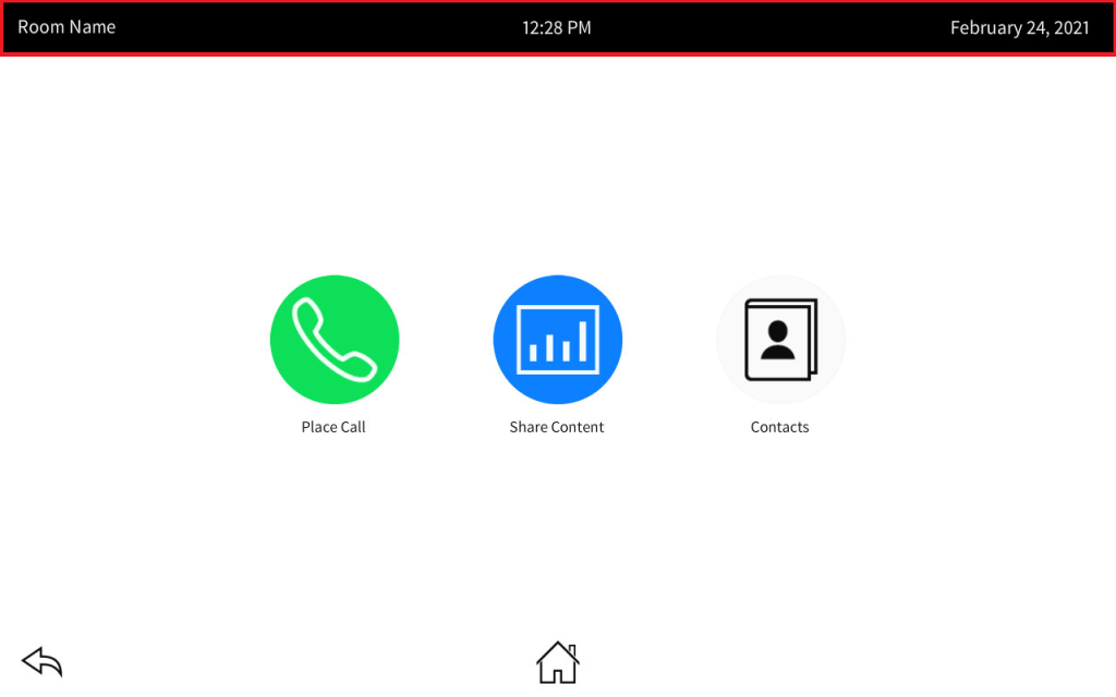
Home Page
With the header and footer out of the way, we can work on the home page. The Shell Template wants to put page navigation in the content area, and I don’t want that. So first I will dumb down /app/template/components/pages/template-content/template-content.handlebars:
<div id="template-content-page-wrapper">
    <div id="content-index-body">
        {{#ifEquals menuOrientation "horizontal"}}
        <div class="horizontal-menu">
        {{/ifEquals}}
        {{#ifEquals menuOrientation "vertical"}}
        <div class="vertical-menu">
        {{/ifEquals}}
        {{#ifEquals menuOrientation "none"}}
        <div class="no-menu">
        {{/ifEquals}}

            <!-- Insert pages -->
            <ch5-triggerview{{#each content/triggerViewProperties}}{{#if (isdefined this)}} {{@key}}="{{{this}}}" {{/if}}{{/each}} class="triggerview" activeview="{{defaultView content}}">
            {{#sortPages content/pages}}
            <!-- Page {{pageName}} starts -->
                <ch5-triggerview-child{{#each triggerViewChildProperties}}{{#if (isdefined this)}} {{@key}}="{{{this}}}" {{/if}}{{/each}}>
                <ch5-import-htmlsnippet{{#each pageProperties}}{{#if (isdefined this)}} {{@key}}="{{{this}}}" {{/if}}{{/each}} id="{{pageName}}-import-page" url="{{fullPath}}{{fileName}}">
                </ch5-import-htmlsnippet>
                </ch5-triggerview-child>
            <!-- Page {{pageName}} ends -->
            {{/sortPages}}
            </ch5-triggerview>

        </div>
    </div>
</div>
Now we can replace /app/project/components/pages/home/home.html with:
<section id="home-page" class="details-container" aria-labelledby="Home">
    <nav>
        <div>
            <ch5-button shape="circle" size="x-large"
                customclass="btn-green"
                customclasspressed="btn-green-pressed"
                iconurl="./app/project/assets/img/Phone_Light.png">
            </ch5-button>
            <p>Place Call</p>
        </div>
        <div>
            <ch5-button shape="circle" size="x-large"
                customclass="btn-blue"
                customclasspressed="btn-blue-pressed"
                iconurl="./app/project/assets/img/Graph_Light.png">
            </ch5-button>
            <p>Share Content</p>
        </div>
        <div>
            <ch5-button shape="circle" size="x-large"
                customclass="btn-gray"
                customclasspressed="btn-gray-pressed"
                iconurl="./app/project/assets/img/Address-Book_Light.png">
            </ch5-button>
            <p>Contacts</p>
        </div>
    </nav>
</section>
And style it with home.scss in the same folder:
#home-page {
    display: grid;
    grid-template-rows: 1fr 1fr 1fr;
    grid-template-columns: 1fr 50% 1fr;

    nav {
        display: grid;
        grid-template-rows: 1fr;
        grid-template-columns: 1fr 1fr 1fr;
        justify-items: center;
        align-items: center;
        grid-row: 2 / span 1;
        grid-column: 2 / span 1;

        div {
            text-align: center;
        }

        p {
            margin: 1em 0 1em 0;
        }

        .ch5-button--img {
            height: auto;
            width: 80%;
        }
    }

    .btn-blue {
        background-color: #0d80ff;
        border: none;
    }

    .btn-blue-pressed {
        background-color: #0a60bf;
    }

    .btn-green {
        background-color: #0ddf58;
        border: none;
    }

    .btn-green-pressed {
        background-color: #0bbf4b;
    }

    .btn-gray {
        background-color: #808080;
        border: none;
    }

    .btn-gray-pressed {
        background-color: #404040;
    }
}
Getting to Other Pages
We can see the Home page since it’s the default, but how do we get to the other pages to see what they look like? For now, we’ll use JavaScript to get around. Replace home.js with this:
let homeModule = (function () {
    'use strict';

    let outputValue = true;

    /**
     * Initialize Method
     */
    function onInit() {
       serviceModule.addEmulatorScenarioNoControlSystem("./app/project/components/pages/home/home-emulator.json");
       // Uncomment the below line and comment the above to load the emulator all the time.
       // serviceModule.addEmulatorScenario("./app/project/components/pages/home/home-emulator.json");

        var btnDial = document.querySelector('#dial');
        if (btnDial !== null) {
          btnDial.addEventListener('click', function() {
              templateContentModule.navMenu(1);
          });
        }

        var btnContent = document.querySelector('#content');
        if (btnContent !== null) {
          btnContent.addEventListener('click', function() {
              templateContentModule.navMenu(2);
          });
        }

        var btnContacts = document.querySelector('#contacts');
        if (btnContacts !== null) {
          btnContacts.addEventListener('click', function() {
              templateContentModule.navMenu(3);
          });
        }

        var btnPrevPage = document.querySelector('#prevPage');
        if (btnPrevPage !== null) {
          btnPrevPage.addEventListener('click', function() {
            console.log('prevPage');
          })
        }

        var btnHome = document.querySelector('#home');
        if (btnHome !== null) {
          btnHome.addEventListener('click', function() {
            templateContentModule.navMenu(0);
          });
        }

        var btnShutdown = document.querySelector('#shutdown');
        if (btnShutdown !== null) {
          btnShutdown.addEventListener('click', function() {
            console.log('shutdown');
          });
        }
    }

    /**
     * Declare your Public Methods here
     */
    function getOutput() {
        return outputValue;
    }

    /**
     * All public or private methods which need to call onInit
     */
    const homePage = document.querySelector('#home-import-page');
    if (homePage !== null) {
        homePage.addEventListener('afterLoad', onInit);
    }

    /**
     * All public method and properties are exported here
     */
    return {
        getOutput: getOutput
    };
}());
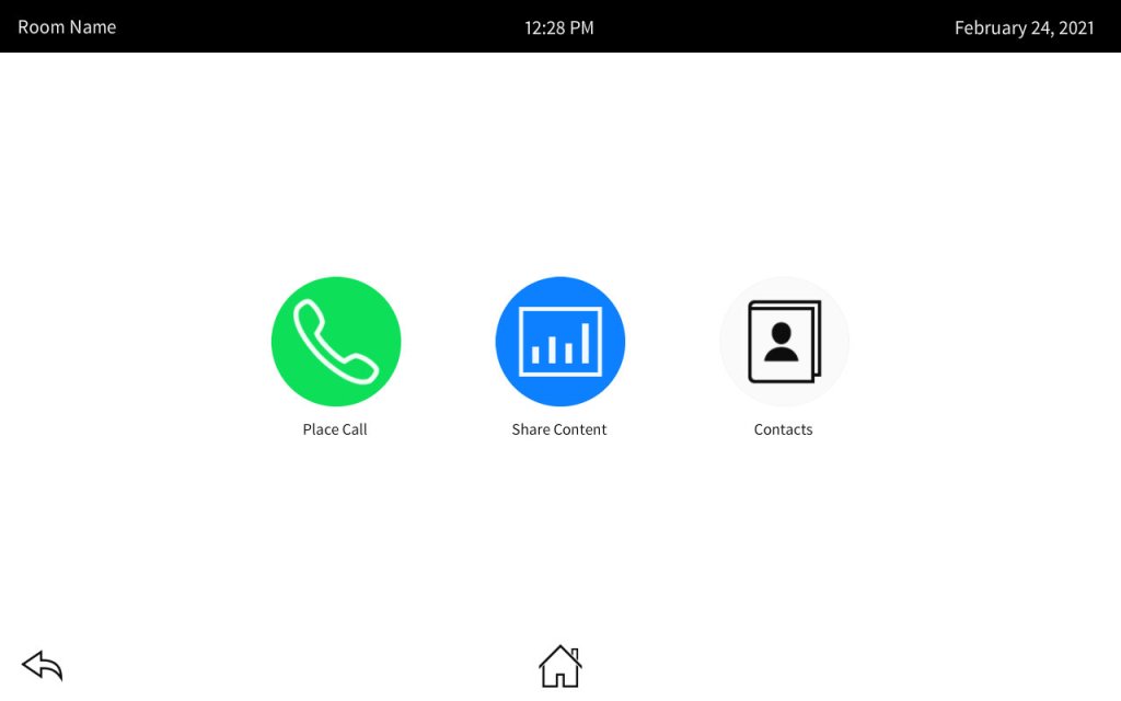
Now we can click the buttons on the Home page to visit the other pages. To get back, click the Home button at the bottom of the page. Here it is in action:
Next, we’ll tackle the Dial page.
Dial Page
The Dial page looks like this, and we can chunk it up into a few components:

Here’s /app/project/components/pages/dial/dial.html:
<section id="dial-page" class="details-container" aria-labelledby="Dial">
    <div id="dialer">
        <div class="number">
            <ch5-button shape="circle"
                iconurl="./app/project/assets/img/Keyboard_Dark.png"></ch5-button>
            <ch5-textinput stretch="width"></ch5-textinput>
            <ch5-button shape="circle"
                iconurl="./app/project/assets/img/Delete-Alt_Dark.png"></ch5-button>
        </div>
        <div class="keypad">
            <ch5-button stretch="both" label="1"></ch5-button>
            <ch5-button stretch="both" label="2"></ch5-button>
            <ch5-button stretch="both" label="3"></ch5-button>
            <ch5-button stretch="both" label="4"></ch5-button>
            <ch5-button stretch="both" label="5"></ch5-button>
            <ch5-button stretch="both" label="6"></ch5-button>
            <ch5-button stretch="both" label="7"></ch5-button>
            <ch5-button stretch="both" label="8"></ch5-button>
            <ch5-button stretch="both" label="9"></ch5-button>
            <ch5-button stretch="both" label="*"></ch5-button>
            <ch5-button stretch="both" label="0"></ch5-button>
            <ch5-button stretch="both" label="#"></ch5-button>
        </div>
        <div class="buttons">
            <ch5-button type="danger" size="large"
                stretch="width"
                iconurl="./app/project/assets/img/Phone-Down_Light.png"></ch5-button>
            <ch5-button type="success" size="large"
                stretch="width"
                iconurl="./app/project/assets/img/Phone_Light.png"></ch5-button>
        </div>
    </div>
</section>
Oh man did I struggle with the CSS on this one:
#dial-page {
    display: grid;
    grid-template-rows: 1fr;
    grid-template-columns: 1fr;
    justify-items: center;
    align-items: center;

    #dialer {
        width: 30%;
        height: 80%;
        padding: 1em;
        margin: auto;

        .number {
            display: grid;
            grid-template-columns: 50px 1fr 50px;
            grid-column-gap: 1em;
            justify-items: center;
            align-items: center;

            .ch5-button {
                padding: 0;

                .cb-btn {
                    width: auto;
                    padding: 4px;
                }

                .ch5-button--img {
                    width: 40px;
                    height: auto;
                    margin: 0;
                }
            }

            .ch5-button--default {
                background: none;
                border: none;
                box-shadow: none;
            }

            .ch5-button--pressed {
                background: whitesmoke;
            }

            .ch5-textinput__assets {
                border: solid 1px #888;
                border-radius: 0;
                box-shadow: none;
            }

            .ch5-textinput__input--regular {
                background: none;
                padding: 4px;
                font-size: 20pt;
                min-width: 80px;
            }
        }

        .keypad {
            background: whitesmoke;
            display: grid;
            grid-template-columns: 1fr 1fr 1fr;
            grid-template-rows: 1fr 1fr 1fr 1fr;
            grid-column-gap: 1em;
            grid-row-gap: 1em;
            justify-items: center;
            align-items: center;
            height: 65%;
            padding: 1em;
            margin: 1em -1em;
        }

        .buttons {
            display: grid;
            grid-template-columns: 1fr 1fr;
            grid-column-gap: 1em;
            justify-items: center;
            align-items: center;

            .cb-btn {
                width: 100%;
            }

            .ch5-button {
                .ch5-button--img {
                    height: 35px;
                    width: auto;
                }
            }
        }
    }
}
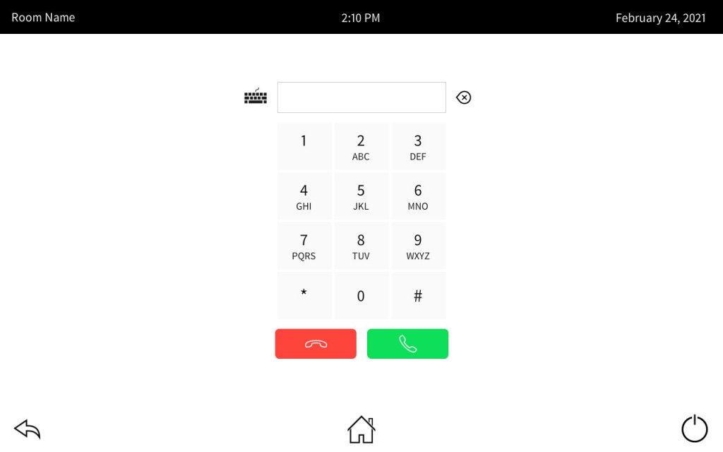
The result is close to what I wanted… I could probably get it closer but I’m losing interest in using this framework:
Content Page
We can quickly run through the content page as well. Here’s /app/project/components/pages/content/content.html:
<section id="content-page" class="details-container" aria-labelledby="Content">
    <div id="sources">
        <div class="src">
            <ch5-button stretch="both" label="Laptop"
                iconurl="./app/project/assets/img/Laptop_Light.png"></ch5-button>
            <p class="status">HDMI Detected</p>
        </div>
        <div class="src">
            <ch5-button stretch="both" label="AirMedia"
                iconurl="./app/project/assets/img/AirMedia_Light.png"></ch5-button>
            <p class="status">Login Code: 1234</p>
        </div>
        <div class="src">
            <ch5-button stretch="both" label="AppleTV"
                iconurl="./app/project/assets/img/Apple_Light.png"></ch5-button>
            <p class="status">HDMI Detected</p>
        </div>
    </div>
</section>
And the style in /app/project/components/pages/content/content.scss:
#content-page {
    justify-items: center;
    align-items: center;

    #sources {
        display: grid;
        grid-template-columns: 1fr 1fr 1fr;
        grid-column-gap: 1em;
        width: 70%;
        height: 30%;
        padding: 1em;
        margin: 10% auto;

        .src {
            .status {
                background-color: darkviolet;
                color: white;
                font: italic 12pt Arial, sans-serif;
                text-align: center;
                padding: 0.5em 0.3em 0.3em 0.3em;
                position: relative;
                top: -3px;
                z-index: -1;
            }

            .ch5-button {
                padding: 1em;
                min-height: 200px;

                .cb-btn {
                    display: block;
                    justify-content: center;
                }

                .ch5-button--img {
                    width: 150px;
                    height: auto;
                    margin: 1em auto;
                }

                .ch5-button--label {
                    font-size: 13pt;
                    text-align: center;
                }
            }
        }
    }
}
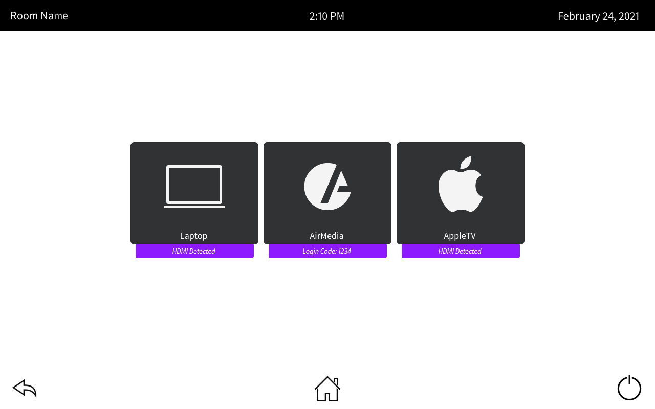
Which looks like this:
Contacts Page
And lastly we have the contacts page. This one is a bit more involved, but I think we can break it up like this:

Update /app/project/components/pages/contacts/contacts.html:
<section id="contacts-page" class="details-container" aria-labelledby="Contacts">
    <div id="contacts">
        <div class="listing">
            <div class="list">
                <ch5-list size="6"
                    orientation="vertical"
                    indexId="n">
                    <template>
                        <div class="vertical-list-item">
                            <span>item_{{n}}</span>
                        </div>
                    </template>
                </ch5-list>
            </div>
            <div class="details">
                <div>
                    <ch5-image
                        url="./app/project/assets/img/User_Dark.png"></ch5-image>
                    <p class="name">John Doe</p>
                    <p class="number">jdoe@contoso.com</p>
                </div>
                <div class="buttons">
                    <ch5-button shape="circle"
                        iconurl="./app/project/assets/img/Pen_Light.png"></ch5-button>
                    <ch5-button shape="circle"
                        iconurl="./app/project/assets/img/Star_Light.png"></ch5-button>
                    <ch5-button shape="circle"
                        iconurl="./app/project/assets/img/Delete_Light.png"></ch5-button>
                </div>
            </div>
        </div>
        <div class="buttons">
            <ch5-button id="contactsHangUp" type="danger" size="large"
                stretch="width"
                iconurl="./app/project/assets/img/Phone-Down_Light.png"></ch5-button>
            <ch5-button id="contactsDial" type="success" size="large"
                stretch="width"
                iconurl="./app/project/assets/img/Phone_Light.png"></ch5-button>
        </div>
    </div>
</section>
And the stylesheet /app/project/components/pages/contacts/contacts.scss:
#contacts-page {
    display: flex;
    justify-content: center;
    align-items: center;

    #contacts {
        display: grid;
        grid-template-rows: 3fr 1fr;
        width: 80%;
        height: 80%;

        .listing {
            display: grid;
            grid-template-columns: 1fr 1fr;
            grid-column-gap: 1em;

            .details {
                display: grid;
                grid-template-rows: 2fr 1fr;
                justify-content: center;
                text-align: center;

                .buttons {
                    display: flex;
                    justify-content: space-around;
                    min-width: 350px;
                }
            }
        }

        .buttons {
            display: grid;
            grid-template-columns: 1fr 1fr 1fr 1fr;
            grid-column-gap: 1em;
            justify-items: center;
            align-items: center;

            .cb-btn {
                width: 100%;
            }

            .ch5-button {
                .ch5-button--img {
                    height: 35px;
                    width: auto;
                }
            }

            #contactsHangUp {
                grid-column-start: 2;
            }

            #contactsDial {
                grid-column-start: 3;
            }
        }
    }
}
And here’s how it looks:

One last thing left to deal with!
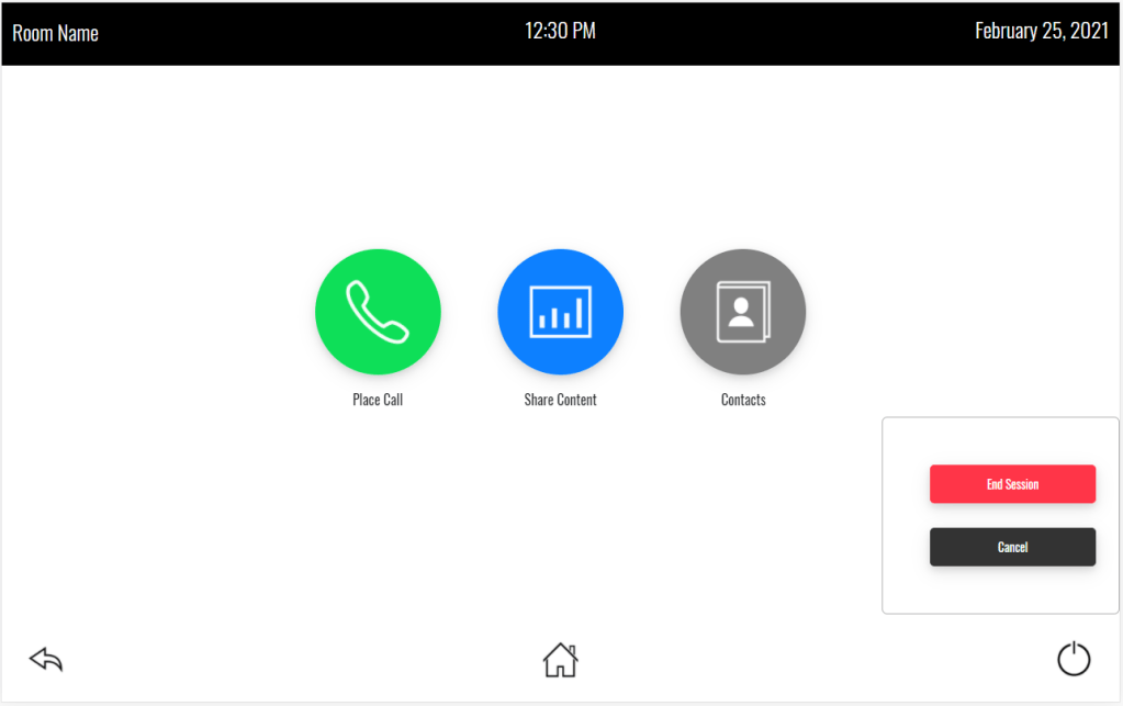
Shutdown Popup
We want to show a shutdown confirmation when the user clicks the power button in the lower-right corner. We can add this to /app/template/components/pages/template-content.handlebars:
<div id="template-content-page-wrapper">
    <div id="content-index-body">
        {{#ifEquals menuOrientation "horizontal"}}
        <div class="horizontal-menu">
        {{/ifEquals}}
        {{#ifEquals menuOrientation "vertical"}}
        <div class="vertical-menu">
        {{/ifEquals}}
        {{#ifEquals menuOrientation "none"}}
        <div class="no-menu">
        {{/ifEquals}}

            <!-- Insert pages -->
            <ch5-triggerview{{#each content/triggerViewProperties}}{{#if (isdefined this)}} {{@key}}="{{{this}}}" {{/if}}{{/each}} class="triggerview" activeview="{{defaultView content}}">
            {{#sortPages content/pages}}
            <!-- Page {{pageName}} starts -->
                <ch5-triggerview-child{{#each triggerViewChildProperties}}{{#if (isdefined this)}} {{@key}}="{{{this}}}" {{/if}}{{/each}}>
                <ch5-import-htmlsnippet{{#each pageProperties}}{{#if (isdefined this)}} {{@key}}="{{{this}}}" {{/if}}{{/each}} id="{{pageName}}-import-page" url="{{fullPath}}{{fileName}}">
                </ch5-import-htmlsnippet>
                </ch5-triggerview-child>
            <!-- Page {{pageName}} ends -->
            {{/sortPages}}
            </ch5-triggerview>

        </div>

        <ch5-overlay-panel
            receivestateshowpulse="show_shutdown"
            receivestatehidepulse="hide_shutdown"
            positionto="footer-page"
            positionoffset="top-right"
            mask="true"
            dismissable="true">
            <div id="shutdown">
                <ch5-button type="danger" label="End Session"
                    stretch="width"
                    sendeventonclick="hide_shutdown"></ch5-button>
                <ch5-button label="Cancel"
                    stretch="width"
                    sendeventonclick="hide_shutdown"></ch5-button>
            </div>
        </ch5-overlay-panel>
    </div>
</div>
Add a little bit of style to /app/project/assets/scss/style.scss:
html,
body {
    background: white;
}

#shutdown {
    ch5-button {
      margin: 1em;
    }
  }
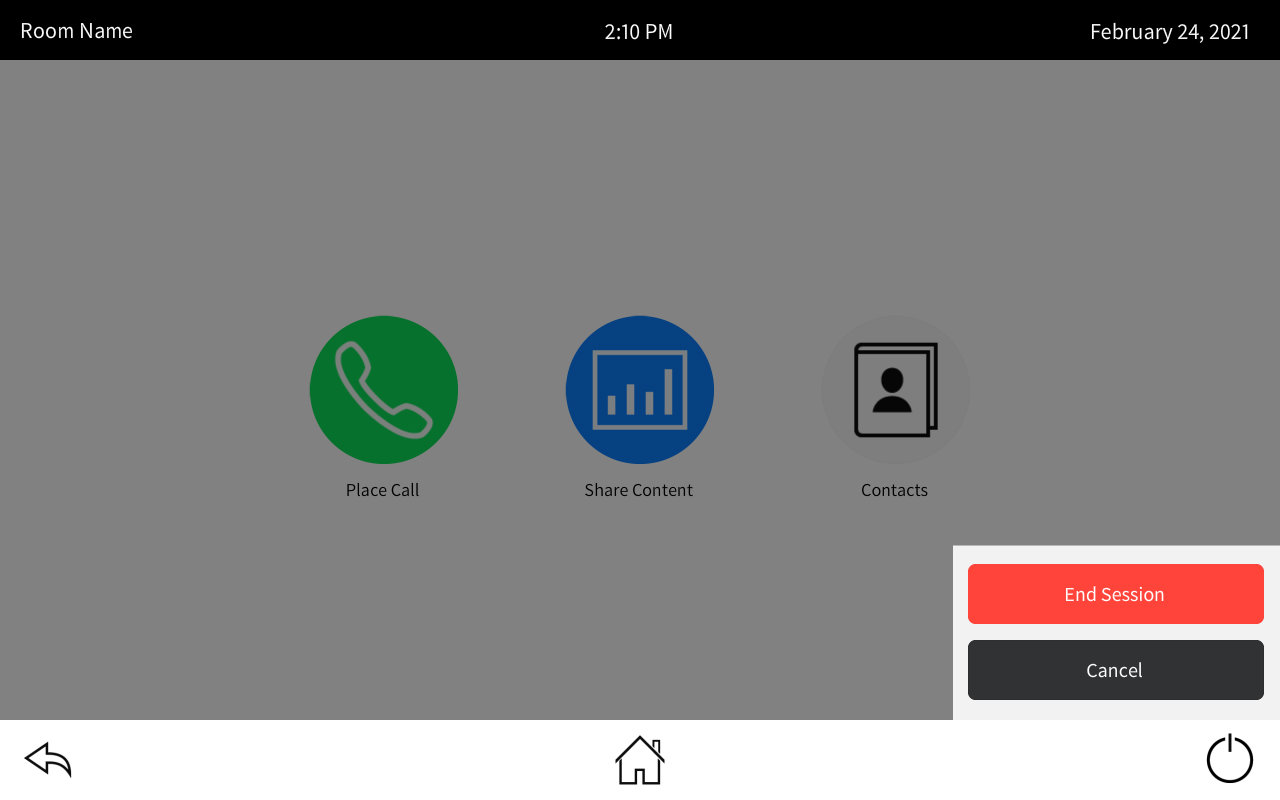
I’m going to say this looks close enough to my mock-up to pass:
There you go, we recreated our touchpanel look (somewhat) in CH5, but we haven’t put in any of the program logic yet. We would still need to tie join numbers to buttons or use the contract editor to give them names. There’s still a lot of work to be done. And this layout focused on just a TS-770 panel, I didn’t worry to much about testing other resolutions. But if we were creating a real template, we’d want to make sure the behavior and look on a 570 panel is correct as well as a 1070.
Next Time
I think for the next post I’m going to take a break from programming and instead give my thoughts on the CH5 framework and HTML5 in general. I don’t know how much value this post will retain, I’ve skimmed it a few times but don’t think I will refer back to it very often. And I’m sure if I were more familiar with CH5 and how Crestron wants you to use it, I’d probably catch things I did that made this process harder. I’m not going to completely abandon CH5, but I think I need to take a break from it for a bit.
 Kiel the Coder
3 thoughts on “CH5: Full Project”