
In this post, we’re going to greatly simplify how we create touchpanel layouts: we’re going to ditch the Contract Editor and most of the CH5 components. I do think these tools have value in the right hands, but I want to explore going my own direction. We might reinvent some of their features, but I think it will pay off from the learning aspect. And we’ll know how our program works, inside and out.
You might want to grab the code from my GitHub repo to make it easier to follow along.
Advanced Programming
On the CH5 Developer Microsite, there’s a section under Advanced Programming that tells us how to bypass the CH5 elements. It’s done with a pair of functions exported from CrComLib:
- publishEvent sends a signal from the touchpanel to the control system (like a button press)
- subscribeState receives feedback from the control system (like a page flip)
This is how traditional AV programming evolves: we are (almost) never going to send button presses directly to the control processor ever again! Instead, we will notify the processor when events happen, and it will notify us when state changes. It will mean looking at the communication between UI and program at a higher level, but it will also mean dividing our programming efforts more evenly between front-end and back-end.
A Simple Layout
We can sit and wonder how a UI like this might work, or we can start coding it! I get to a point where I just need to see something in front of me.
So, here’s a mock up of the layout I want to create (use the arrows to flip through the gallery):


If you couldn’t guess, I’ve used VT-Pro to create this layout. Having a quick way to lay out components on the page is great, and VT-Pro is designed for touchpanel layouts. So even though we can’t use it to generate HTML5 projects, it still works well for wireframing.
Make sure to git pull any updates then get ready for a lot of typing!
Open VS Code and update src/index.html. I’m not going to go through this step-by-step (I’ve done that previously), and it’s a basic layout, so it should be easy enough to follow the structure:
<!DOCTYPE html>
<html lang="en">
<head>
<meta charset="UTF-8">
<meta http-equiv="X-UA-Compatible" content="IE=edge">
<meta name="viewport" content="width=device-width, initial-scale=1.0">
<title>Document</title>
<link rel="stylesheet" href="style.css">
</head>
<body>
<section id="top">
<div id="room-name">Room Name</div>
<div id="time">12:00 PM</div>
<div id="date">Tuesday, July 27, 2021</div>
</section>
<section id="view">
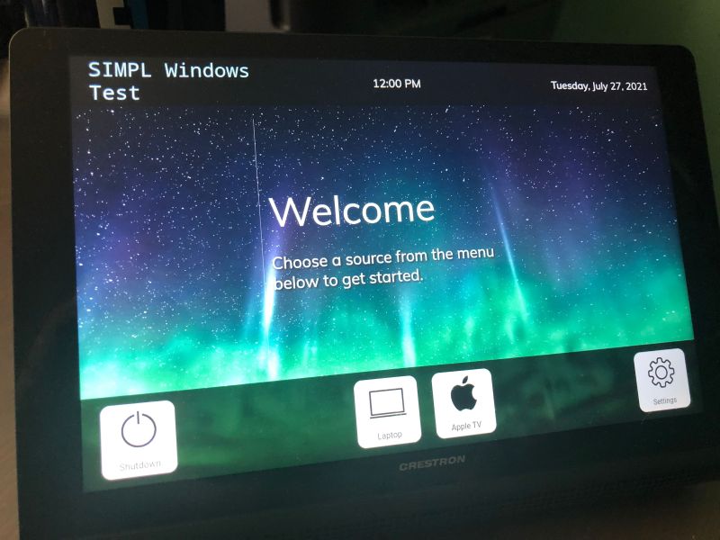
<div class="card active" id="card-welcome">
<div></div>
<div class="text welcome-text">
<h1>Welcome</h1>
<h2>Choose a source from the menu below to get started.</h2>
</div>
</div>
<div class="card" id="card-laptop">
<div class="icon">
<img src="./assets/img/Laptop.png" />
</div>
<div class="text">
<h1>Laptop</h1>
<h2>Make sure your laptop is connected to the HDMI cable at the table.</h2>
</div>
</div>
<div class="card" id="card-appletv">
<div class="icon">
<img src="./assets/img/AppleTV.png" />
</div>
<div class="text">
<h1>Apple TV</h1>
</div>
</div>
<div class="popup">
<div class="card" id="popup-settings">
<div class="icon">
<img src="./assets/img/Gear.png" />
</div>
<div class="text">
<h1>Settings</h1>
<h2>TODO</h2>
<h3>
<button class="accept">Apply</button>
<button class="normal">Cancel</button>
</h3>
</div>
</div>
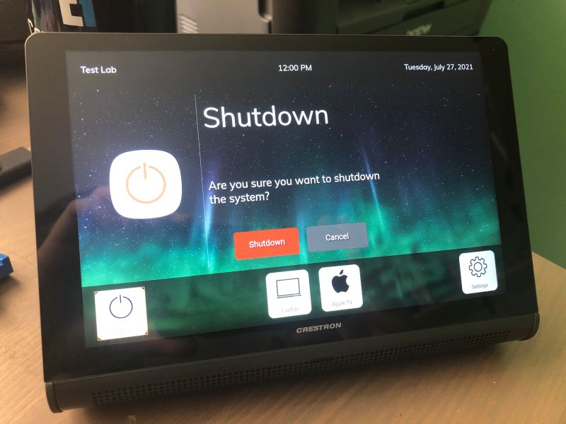
<div class="card " id="popup-shutdown">
<div class="icon">
<img src="./assets/img/Power.png" />
</div>
<div class="text">
<h1>Shutdown</h1>
<h2>Are you sure you want to shutdown the system?</h2>
<h3>
<button class="danger">Shutdown</button>
<button class="normal">Cancel</button>
</h3>
</div>
</div>
</div>
</section>
<section id="bottom">
<div class="system">
<button>
<img class="icon" src="./assets/img/Power_Dark.png" />
<span class="text">Shutdown</span>
</button>
</div>
<div class="sources">
<button>
<img class="icon" src="./assets/img/Laptop_Dark.png" />
<span class="text">Laptop</span>
</button>
<button>
<img class="icon" src="./assets/img/Apple_Dark.png" />
<span class="text">Apple TV</span>
</button>
</div>
<div class="settings">
<button>
<img class="icon" src="./assets/img/Gear_Dark.png" />
<span class="text">Settings</span>
</button>
</div>
</section>
<script src="bundle.js"></script>
</body>
</html>
I’ve divided the layout into 3 sections: top, view, and bottom. Within view, there are many cards that represent the subpages we plan to display.
Add CSS to src/style.css to make it pretty:
@import url('https://fonts.googleapis.com/css2?family=Muli:wght@400;700&display=swap');

* {
    box-sizing: border-box;
    margin: 0;
    padding: 0;
}

body {
    display: grid;
    grid-template-rows: 1fr 5.5fr 1.5fr;
    height: 100vh;
    width: 100vw;
    overflow: hidden;
    background: black;
    background-image: url('./assets/img/Space_Aurora_1920x1200.jpg');
    background-size: cover;
    color: white;
    font-family: 'Muli', sans-serif;
    font-size: 1.5rem;
}

#top {
    display: grid;
    grid-template-columns: 1fr 1fr 1fr;
    align-items: center;
    background-color: #000000;
    color: #ffffff;
    font-size: 1.5rem;
}

#room-name {
    margin-left: 2rem;
    text-align: left;
}

#time {
    text-align: center;
}

#date {
    margin-right: 2rem;
    text-align: right;
}

#view {
    display: flex;
    justify-content: center;
    align-items: center;
    color: #ffffff;
}

#bottom {
    display: grid;
    grid-template-columns: 1fr 2fr 1fr;
    align-items: center;
    justify-content: center;
    background-color: rgba(0,0,0,0.8);
    color: #ffffff;
    font-size: 1.5rem;
    padding: 0 1rem;
}

#bottom .system {
    display: flex;
    justify-content: left;
}

#bottom .sources {
    display: flex;
    justify-content: center;
}

#bottom .settings {
    display: flex;
    justify-content: flex-end;
}

#bottom button {
    background-color: #dadada;
    border: solid 1px #bababa;
    border-radius: 1rem;
    margin: 1rem;
    width: 8rem;
    height: 8rem;
    position: relative;
}

#bottom button .icon {
    position: absolute;
    max-width: 75%;
    top: 0;
    left: 50%;
    transform:translateX(-50%);
}

#bottom button .text {
    display: block;
    position: absolute;
    bottom: 0.5rem;
    left: 0;
    width: 100%;
    font-size: 1rem;
    text-align: center;
}

.card {
    display: none;
    width: 100%;
    margin: 0 2rem;
    height: 90%;
}

.card.active {
    display: grid;
    grid-template-columns: 1fr 3fr;
}

.popup {
    display: none;
    background-color: rgba(0,0,0,0.5);
    width: 100%;
    height: 100%;
}

.popup.active {
    display: flex;
    justify-content: center;
    align-items: center;
}

.card .icon {
    display: flex;
    align-items: center;
    justify-content: center;
    width: 100%;
    height: 100%;
}

.card .icon img {
    max-width: 80%;
}

.card .text {
    border-left: solid 1px rgba(255,255,255,0.3);
    padding: 1rem;
}

.card .text h1 {
    font-size: 5rem;
    font-weight: normal;
    margin-bottom: 2rem;
}

.card .text h2 {
    font-size: 2rem;
    font-weight: normal;
    text-shadow: 2px 2px 4px #000000;
    width: 60%;
    margin-top: 8rem;
}

.card .text h3 {
    width: 60%;
    margin-top: 5rem;
    text-align: center;
}

.card .welcome-text {
    display: flex;
    flex-direction: column;
    justify-content: center;
}

.card .welcome-text h2 {
    margin-top: 0 !important;
}

.card button {
    background-color: #dadada;
    border: solid 1px #bababa;
    border-radius: 0.5rem;
    padding: 1.5rem;
    width: 12rem;
    font-size: 1.5rem;
    text-shadow: 2px 2px 4px #000000;
}

.card button + button {
    margin-left: 1rem;
}

.card button.accept {
    background-color: #1133ba;
    border: solid 1px #0000aa;
    color: #fafafa;
}

.card button.danger {
    background-color: #ba1111;
    border: solid 1px #aa0000;
    color: #fafafa;
}

.card button.normal {
    background-color: #444444;
    border: solid 1px #333333;
    color: #fafafa;
}
You’ll need to provide image assets for the icons and background. I have some checked into the GitHub repository should you choose to stick with those.
Updating Our Build Scripts
There’s now quite a folder structure to contend with when we’re packaging up our touchpanel layout.
Webpack does almost everything we need, and we can extend it further with plugins. In this case, we’re going to use CopyWebpackPlugin.
Install copy-webpack-plugin by typing into Terminal:
> npm install --save-dev copy-webpack-pluginWe’ll use this plugin to copy files (using pattern matching) from one directory into another.
Update webpack.config.js to use the new plugin:
const path = require('path');

const CopyPlugin = require('copy-webpack-plugin');

module.exports = {
    mode: 'development',
    entry: './src/app.js',
    output: {
        filename: 'bundle.js',
        path: path.resolve(__dirname, 'dist')
    },
    plugins: [
        new CopyPlugin({
            patterns: [
                {
                    from: 'src/assets',
                    to: 'assets/'
                },
                {
                    from: 'src/*.(html|css)',
                    to: '[name][ext]'
                }
            ]
        })
    ]
}
When we run the build NPM script, Webpack will now copy static assets into the dist folder, ready for archiving.
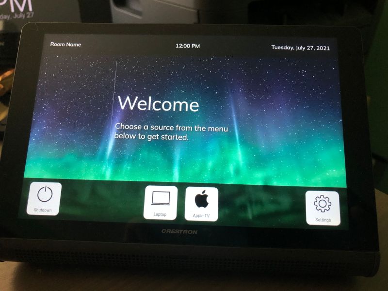
Go ahead and run the onestep script now. Copy the generated archive to your touchpanel (or to your controller for XPanel). You won’t be able to click around anywhere yet, but I think it looks pretty close to our mock-up!
Commit your changes to git and we can move onto the next problem: making the touchpanel do something.
Receiving State
Lets start with getting the room name from the program and displaying it on the touchpanel. Add this to the end ofsrc/app.js:
const CrComLib = require('../node_modules/@crestron/ch5-crcomlib/build_bundles/cjs/cr-com-lib.js');

window.CrComLib = CrComLib;
window.bridgeReceiveIntegerFromNative = CrComLib.bridgeReceiveIntegerFromNative;
window.bridgeReceiveBooleanFromNative = CrComLib.bridgeReceiveBooleanFromNative;
window.bridgeReceiveStringFromNative = CrComLib.bridgeReceiveStringFromNative;
window.bridgeReceiveObjectFromNative = CrComLib.bridgeReceiveObjectFromNative;

CrComLib.subscribeState('s', 1, (value) => {
    const elem = document.getElementById('room-name');
    elem.innerHTML = value;
});
We use subscribeState to listen to serial join 1. When it changes, our handler gets called. In the handler, we find the HTML element with the ID room-name. Then we set its innerHTML to whatever value passed in.
Next, we need to update the SIMPL program to no longer use a contract file. Go back to Project > Manage GUI Extenders, select both touchpanel symbols, and hit Clear:

Hit Commit Changes and the Room component on both symbols will be commented out. Drag the room_name$ signal from the Room component onto text-o1 on the touchpanel symbol. Make sure to also do the same thing for the XPanel symbol.

Build the program and send it to your control processor.
Back in VS Code, we can eliminate the contract file from our archive script. Modify package.json slightly:
"scripts": {
    "build": "webpack",
    "archive": "ch5-cli archive -p project -d dist -o archive",
    "onestep": "npm run build && npm run archive"
  },
Run the onestep script and send project.ch5z to your touchpanel. Once the touchpanel comes online, you’ll see the room name change to whatever the SIMPL program sends it. If you open SIMPL debugger, you can send other values to room_name$, even including HTML (remember, we’re just taking whatever comes in and setting it to innerHTML on the room-name element). So, you could change the font style, text color, whatever from within SIMPL:
So far, this isn’t too different from how we programmed SmartGraphics layouts. We take a value in on a serial join and update some text on the touchpanel.
Our Touchpanel Layout Is Now a Program
Old touchpanel layouts were pretty lifeless: they couldn’t do much on their own. Some SmartGraphics widgets were exceptional (such as the TV Presets and Weather widgets). To achieve dynamic layouts, we had to drive everything from the control processor.
But HTML5 layouts can run JavaScript, a full-fledged programming language. So why not take advantage of that? We can do most of the front-end logic right in the touchpanel layout itself. For the times when we want to keep multiple panels in sync, we can push state from the control program.
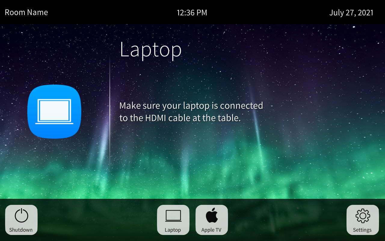
Probably the biggest UI element missing right now is the ability to view different subpages. Lets work on that now, starting with the Laptop and Apple TV ones. We need to add IDs to our buttons in src/index.html:
<section id="bottom">
    <div class="system">
        <button id="btn-shutdown">
            <img class="icon" src="./assets/img/Power_Dark.png" />
            <span class="text">Shutdown</span>
        </button>
    </div>
    <div class="sources">
        <button id="btn-laptop">
            <img class="icon" src="./assets/img/Laptop_Dark.png" />
            <span class="text">Laptop</span>
        </button>
        <button id="btn-appletv">
            <img class="icon" src="./assets/img/Apple_Dark.png" />
            <span class="text">Apple TV</span>
        </button>
    </div>
    <div class="settings">
        <button id="btn-settings">
            <img class="icon" src="./assets/img/Gear_Dark.png" />
            <span class="text">Settings</span>
        </button>
    </div>
</section>
And at the end of src/app.js add:
CrComLib.subscribeState('s', '1', (value) => {
    const elem = document.getElementById('room-name');
    elem.innerHTML = value;
});

var activeCard = document.getElementById('card-welcome');

function showCard (nextCard) {
    if (activeCard.id != nextCard) {
        const popup = document.getElementsByClassName('popup')[0];
        activeCard.classList.remove('active');

        if (nextCard.substring(0, 6) == 'popup-') {
            popup.classList.add('active');
        }
        else {
            popup.classList.remove('active');
        }

        activeCard = document.getElementById(nextCard);
        activeCard.classList.add('active');
    }
}

const btnLaptop = document.getElementById('btn-laptop');
const btnAppleTV = document.getElementById('btn-appletv');

btnLaptop.addEventListener('click', (e) => showCard('card-laptop'));
btnAppleTV.addEventListener('click', (e) => showCard('card-appletv'));
We’ve created a function named showCard that takes the name of the next card to display. If activeCard has a different ID, then we remove the active class, make the next card element activeCard, then apply the active class to that. Also, if the next card ID begins with the popup- string, we show or hide the popup background (semi-transparent black). Add event handlers for the Settings and Shutdown buttons to the end:
const btnLaptop = document.getElementById('btn-laptop');
const btnAppleTV = document.getElementById('btn-appletv');

btnLaptop.addEventListener('click', (e) => showCard('card-laptop'));
btnAppleTV.addEventListener('click', (e) => showCard('card-appletv'));

const btnSettings = document.getElementById('btn-settings');
const btnShutdown = document.getElementById('btn-shutdown');

btnSettings.addEventListener('click', (e) => showCard('popup-settings'));
btnShutdown.addEventListener('click', (e) => showCard('popup-shutdown'));
If you build and load the touchpanel layout, you can flip around between pages now:
It works for navigation, but there’s a better approach to what we’re doing. We’ll look at that next.
Shared State
If you think about what our buttons should do, it’s two things:
- Display the correct subpage
- Route the correct source
Lets use analog join 1 to represent the current source. We’ll need to modify our button logic in src/app.js:
CrComLib.subscribeState('s', '1', (value) => {
    const elem = document.getElementById('room-name');
    elem.innerHTML = value;
});

var activeCard = document.getElementById('card-welcome');

function showCard (nextCard) {
    if (activeCard.id != nextCard) {
        const popup = document.getElementsByClassName('popup')[0];
        activeCard.classList.remove('active');

        if (nextCard.substring(0, 6) == 'popup-') {
            popup.classList.add('active');
        }
        else {
            popup.classList.remove('active');
        }

        activeCard = document.getElementById(nextCard);
        activeCard.classList.add('active');
    }
}

function routeSource (n) {
    CrComLib.publishEvent('n', '1', n);
}

CrComLib.subscribeState('n', '1', (value) => {
    switch (value) {
        case 0:
            showCard('card-welcome');
            break;
        case 1:
            showCard('card-laptop');
            break;
        case 2:
            showCard('card-appletv');
            break;
    }
});

const btnLaptop = document.getElementById('btn-laptop');
const btnAppleTV = document.getElementById('btn-appletv');

btnLaptop.addEventListener('click', (e) => {
    showCard('card-laptop');
    routeSource(1);
});

btnAppleTV.addEventListener('click', (e) => {
    showCard('card-appletv');
    routeSource(2);
});
We use subscribeState to listen for changes from the control system to make sure we show the correct subpage if the route changes somewhere else (user pushing buttons?). We still call showCard immediately when buttons are pressed because I don’t want there to be an unnecessary feedback delay. This means showCard is called twice: once when we push the button, again when the feedback from the control system arrives. But that’s OK: we wrote showCard in a way to accommodate that.
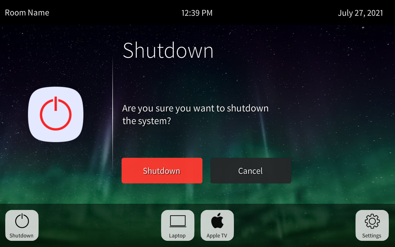
We do need to handle a few more buttons on our layout, so lets give them IDs in src/index.html:
<div class="popup">
    <div class="card" id="popup-settings">
        <div class="icon">
            <img src="./assets/img/Gear.png" />
        </div>
        <div class="text">
            <h1>Settings</h1>
            <h2>TODO</h2>
            <h3>
                <button class="accept" id="btn-settings-apply">Apply</button>
                <button class="normal cancel">Cancel</button>
            </h3>
        </div>
    </div>

    <div class="card " id="popup-shutdown">
        <div class="icon">
            <img src="./assets/img/Power.png" />
        </div>
        <div class="text">
            <h1>Shutdown</h1>
            <h2>Are you sure you want to shutdown the system?</h2>
            <h3>
                <button class="danger" id="btn-shutdown-shutdown">Shutdown</button>
                <button class="normal cancel">Cancel</button>
            </h3>
        </div>
    </div>
 </div>
Besides having some pretty long IDs for the Apply and Shutdown buttons, you might notice we gave the Cancel buttons a cancel class rather than a unique ID. I expect these two buttons to behave the same way, so we can give all Cancel buttons the same event handler. When the user hits Cancel, we want to return to whatever the previous subpage was. We need a way to track that. Add this to src/app.js:
var activeCard = document.getElementById('card-welcome');
var prevCard;

function showCard (nextCard) {
    if (activeCard.id != nextCard) {
        const popup = document.getElementsByClassName('popup')[0];
        activeCard.classList.remove('active');

        if (nextCard.substring(0, 6) == 'popup-') {
            popup.classList.add('active');
        }
        else {
            popup.classList.remove('active');
        }

        prevCard = activeCard;
        activeCard = document.getElementById(nextCard);
        activeCard.classList.add('active');
    }
}
Whenever we flip to a new subpage, we save the previous one in prevCard. This variable will be undefined until we show a different subpage (this will be important in a second). Time to update src/app.js with our new event handlers:
btnSettings.addEventListener('click', (e) => showCard('popup-settings'));
btnShutdown.addEventListener('click', (e) => showCard('popup-shutdown'));

function previousCard() {
    if (prevCard !== undefined) {
        showCard(prevCard.id);
        prevCard = undefined;
    }
}

const btnShutdownShutdown = document.getElementById('btn-shutdown-shutdown');
btnShutdownShutdown.addEventListener('click', (e) => {
    showCard('card-welcome');
    routeSource(0);
});

const btnSettingsApply = document.getElementById('btn-settings-apply');
btnSettingsApply.addEventListener('click', (e) => previousCard());

const btnsCancel = Array.from(document.getElementsByClassName('cancel'))
btnsCancel.forEach((btn) => {
    btn.addEventListener('click', (e) => previousCard());
});
We also create a function called previousCard that flips to the previous subpage (if there is one). I want to make sure we only flip back one level though, so after calling showCard, we set prevCard to be undefined.
Run the onestep script then load this layout to your preferred control surface. We can get around to all the pages now, but there are still some unfinished elements. And make sure you commit your updates to git!
Finishing Touches
We haven’t handled the control system program updates yet! Fire up SIMPL Windows and add this to simpl/HTML5 Demo CP4.smw:
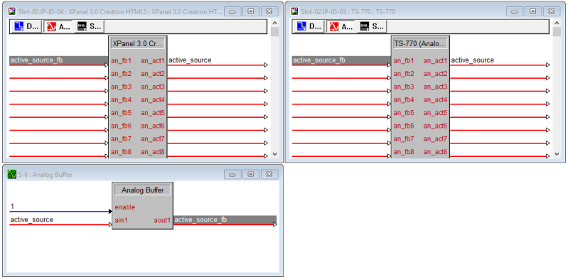
We’re using an Analog Buffer to simulate a video switcher. Load this to your processor. Now you can see the presses come in if you open SIMPL Debugger.
Load the touchpanel project to a physical touchpanel and as a WebXPanel to the processor. Browse to the XPanel and watch what happens when you press the different buttons on the physical touchpanel. When we press Laptop or Apple TV, the subpage flips on both panels. If we press Settings or Shutdown, we only see the pop-up on the panel we used. This is possible because we’re only listening for status updates when the active source changes.
If we want to make the XPanel and touchpanel track exactly, we can pass the state of the current pop-up to the program, and it can relay that out to all attached control surfaces. I suspect we’ll look deeper into this area in a later post, but for now what we’re doing works.
Another thing missing is button feedback to indicate the currently selected subpage. I’d like to make the active button a bright white instead of the normal dull gray. First we’ll add some more CSS to src/style.css:
#bottom button {
    background-color: #dadada;
    border: solid 2px #bababa;
    border-radius: 1rem;
    margin: 1rem;
    width: 8rem;
    height: 8rem;
    position: relative;
}

#bottom button:focus {
    outline: none;
}

#bottom button.active {
    background-color: white;
    border: solid 2px cornflowerblue;
}

#bottom button .icon {
    position: absolute;
    max-width: 75%;
    top: 0;
    left: 50%;
    transform:translateX(-50%);
}
Now, if we add the active class to one of the buttons across the bottom, it will become a brighter white. We also remove the outline since we don’t want the touchpanel to draw that. We’ll change the border color to cornflowerblue and beef it up to 2px for both active and inactive states.
Update src/app.js to apply our new style when we call showCard:
function showCard (nextCard) {
    if (activeCard.id != nextCard) {
        const popup = document.getElementsByClassName('popup')[0];
        activeCard.classList.remove('active');

        if (nextCard.substring(0, 6) == 'popup-') {
            popup.classList.add('active');
        }
        else {
            popup.classList.remove('active');
        }

        prevCard = activeCard;
        activeCard = document.getElementById(nextCard);
        activeCard.classList.add('active');

        const name = activeCard.id.substring(activeCard.id.indexOf('-') + 1);
        const bottom = document.getElementById('bottom');
        Array.from(bottom.getElementsByTagName('BUTTON')).forEach((btn) => {
            if (btn.id == `btn-${name}`) {
                btn.classList.add('active');
            }
            else {
                btn.classList.remove('active');
            }
        });
    }
}
I’m not proud of this function, but it gets the job done. We’ll go through and clean this up soon, I promise! We grab the name from the active subpage and if it matches one of our menu buttons on the bottom, we highlight that button. Note that we’re only grabbing button elements from our bottom section, not the entire HTML document.
The last thing I want to add to this layout is making sure it prints the correct date and time at the top. We don’t need to grab this from the control system, we can let the panel update itself. We’re going to use the moment NPM module to nicely format the date and time. Run this in Terminal:
> npm install momentAdd this to the top of src/app.js:
const CrComLib = require('../node_modules/@crestron/ch5-crcomlib/build_bundles/cjs/cr-com-lib.js');

window.CrComLib = CrComLib;
window.bridgeReceiveIntegerFromNative = CrComLib.bridgeReceiveIntegerFromNative;
window.bridgeReceiveBooleanFromNative = CrComLib.bridgeReceiveBooleanFromNative;
window.bridgeReceiveStringFromNative = CrComLib.bridgeReceiveStringFromNative;
window.bridgeReceiveObjectFromNative = CrComLib.bridgeReceiveObjectFromNative;

const moment = require('moment');

CrComLib.subscribeState('s', '1', (value) => {
    const elem = document.getElementById('room-name');
    elem.innerHTML = value;
});
And finally, add this to the bottom of src/app.js:
const btnsCancel = Array.from(document.getElementsByClassName('cancel'))
btnsCancel.forEach((btn) => {
    btn.addEventListener('click', (e) => previousCard());
});

const lblTime = document.getElementById('time');
const lblDate = document.getElementById('date');

setInterval(() => {
    lblTime.innerText = moment().format('h:mm A');
    lblDate.innerText = moment().format('dddd, MMMM Do, YYYY');
}, 5000);
Our interval runs every 5 seconds to make sure the date and time are correct. If that’s too long of a delay, you can shorten it, but it’s probably not needed.
That’s it! Load the touchpanel layout, test it, commit your updates to git, and call it a day!
Summary
Whew this turned into a long post, but I think it was worth it. We covered:
- A simple HTML layout with enough CSS to make it look like a touchpanel
- Tweaking Webpack to handle the entire build process
- Using publishEvent and subscribeState from CrComLib
- Handling button feedback and page flips in our touchpanel layout
- Synchronizing state between the touchpanel and a SIMPL program
- Using a well-tested library (moment) to handle our date and time formatting
If you made it through all of that, congratulations! In the next post, we’ll focus on what we can do to embrace the 4-series processors and that means we’re going to say goodbye to SIMPL (hooray). I’d also like to spend time cleaning up our JavaScript before it gets too out of control.
Grab the source code from GitHub if you like. Thanks for reading!
 Kiel the Coder
“Make sure to git pull any updates then get ready for a lot of typing!
Open VS Code and update src/index.html.”
Could you be a little more specific? What git repo? What src/index.html file in what file/folder/project obtained from where? Is this the massive Crestron demo with the Vanilla/Angular options? The hardest part I’m trying to get around is downloading Crestron’s complicated demos/templates. I am looking for instructions that start with ‘Open VS Code, File -> New File’, or thereabouts. From having a coffee, to loading a hello world on a TS, from that level of ‘scratch’.
LikeLike
Hi Cory,
Sorry, I should have put a link to my GitHub repo at the top of this post. If you start with https://kielthecoder.com/2021/07/21/create-an-html5-layout/ it will step through the basics. I’ll update the post to include a link, thanks!
LikeLike
Thank you,
The hardest part about CH5, has been finding the proverbial front door. It’s like I have to wait through difficult templates just to create a simple project.
And thank you for your config file post, it really gave me a leg up.
LikeLike
I agree. I wrote a few posts dissecting Crestron’s template and it gave me a real headache trying to get things looking the way I wanted them to. I’ve been light on posts lately (started a new job), but the goal for this series is to build it into several different room types of increasing complexity. I’ve got a Huddle Room post I’ve been sitting on for a month, hopefully I can get that one published soon. Thanks for reading, I appreciate it!
LikeLike
I have already been thinking about how we almost don’t need the crestron protocol if we treat the panel like a centered web page and use the crestron web services to spin up a rest API and basically just treat the processor like any other web service backend. While the joints can be nice I was thinking for the JavaScript I could just use standard rest calls and completely avoid the joint system altogether. This would enable the portability of a project between a touch panel and a standard web page accessed from anything, and some custom desktop apps in Python or C#.
LikeLike
I cant find in your repo the onestep script or even build script. they are missing and you dont say how to build them. I enter them int othe terminal and they fail when I get to the step where you suggest we go ahead and build it now.
onestep : The term ‘onestep’ is not recognized as the name of a cmdlet, function, script file, or operable program. Check the spelling of the name, or if a path
was included, verify that the path is correct and try again.
At line:1 char:1
+ onestep
+ ~~~~~~~
+ CategoryInfo : ObjectNotFound: (onestep:String) [], CommandNotFoundException
+ FullyQualifiedErrorId : CommandNotFoundException
PS D:\Html5 experiments\HTML5-Tutorial-master>
LikeLike
Hi Steve, ‘onestep’ is an NPM script that was added to package.json. I looked at https://github.com/kielthecoder/HTML5-Tutorial/blob/master/package.json and see it on line 9. This might have been added in a previous blog post. I usually reference https://kielthecoder.com/favorites/ if I’m trying to follow all the posts in one series since WordPress doesn’t always recommend the next post in a series. Good luck!
LikeLike